
Label and Packaging Design Examples

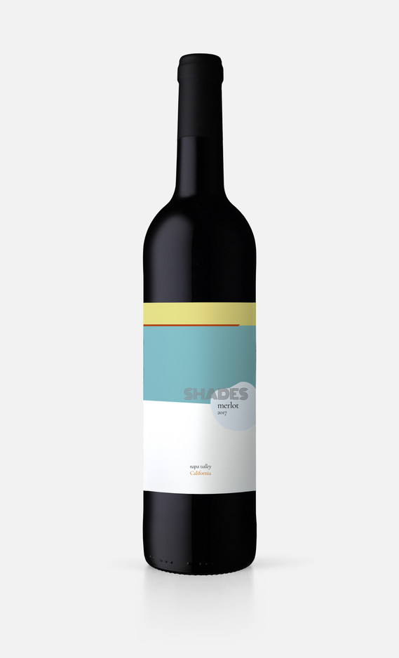
Wine label example for Shades, California
Wine label example for Shades, California

Beer label example for Crazy Cat Beer Company
Organic candy company
This was one of my student projects. We were given a difficult name, Còil 57, and asked to develop and design a logo, brand, visual identity, packaging design and pay-off for a company that produces candies. I decided to make it an organic candy company that would appeal to a wide target market and to the positive new trend toward more healthy food products. For the logo, I chose this particular font because stylistically it reminded me of a coil with its round forms. After many drafts, I settled on a circular logo enclosed in a circular outline to reiterate the coil form. The accent over the "o" turned into a leaf to recall something of organic nature.
I developed the product profile in the following way...Product profile: organic candies in a variety of natural flavors. Target market: all age-groups over 3 years. Pay-off for Italian market: "Bio non è mai stato così divertente!" ("Organic has never been so fun!").
For the packaging design I decided on a style that is colorful and playful while being elegant and simple that would appeal to all age-groups. Below are some examples of the product label.


Mock-up of product package design

Mock-up of back of package